We do everything online these days, including shopping. As a result, e-commerce has become increasingly crucial for both customers and sellers. As a result, if you sell anything online, whether it’s sneakers, cellphones, clothing, or anything in between, you should be prepared to attract customers to your store.
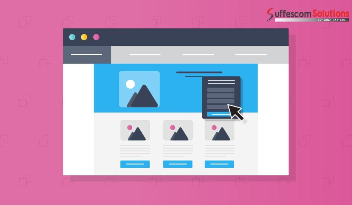
The homePage is the essential part of your e-commerce site, and its design has a significant impact on customer conversion. The homepage of your e-commerce journey is typically the landing page of any e-commerce store, and most users begin their e-commerce journey there. As a result, creating an appealing homepage with the correct elements is critical.
The successful design of the e-commerce homepage relies heavily on visual hierarchy. A solid visual hierarchy allows you to communicate your brand message to customers quickly. The CTA (Call to Action) provides a clear next step for users to take after leaving the homepage, such as the product listing, product details, or other important pages. This article will go over the essential guidelines for the best HomePage Design in your e-commerce store.
First, concentrate on the goal.
Concentrate on your company’s goal. Consider the importance of the elements on the homepage with the plan. Here are some essential things to consider:
- Which sections of the homepage do you want people to click on?
- What information should users have on hand?
- Which pricing plan would you like them to select?
You’ll be able to set the visual hierarchy once you understand the priorities correctly. The main goal of the hierarchy is to make the essential elements stand out, while the less essential elements should be pushed down.
Yes, some elements or sections are more important than others, such as forms, CTAs, value propositions, etc. You must draw more users’ attention to these crucial elements.
Important hyperlinks should be highlighted more prominently.
- Check if your website menu has more than five items; are they all equally important?
- What do you want the user to do when they click?
- What is the likelihood of users clicking on the CTA?
- These issues must be addressed before the visual hierarchy can be established. Let’s take a look at the guidelines now.
Essential Guidelines for Your eCommerce Store’s HomePage Design
Avoid Unnecessary Design Elements – Good for Page Loading
According to a Google study, users judge your website’s beauty in as little as 1/50th to 1/20th of a second. In addition, a visually complex webpage is regarded as less attractive than its simpler counterpart.
The main reason why users consider fewer complex sites to be more beautiful is that decoding, storing, and processing information on a low complexity website does not place any strain on users’ brains or eyes.
The Visual Hierarchy Must Follow The Information Hierarchy
The content’s size and location should correspond to its relative importance. When it comes to size, the larger elements on your homepage will always get the most attention, while elements in the top position will always get the most attention. This is a common visual hierarchy logic that you should follow when designing your homepage.
A Transactional Menu Should Be Prioritized Over A Content Menu
Consider yourself a customer for a moment. Which section, the FAQs (content menu) or the site’s product list (transactional menu), is more important to you now? The latter is the obvious answer. Transactional menus should be placed higher in the visual hierarchy than content menus because users use them more frequently.
Work on Value Proposition – Above the fold
You should prioritize the content on your store’s homepage when designing it. The most important information should come first, followed by the less important information. A homepage’s value proposition is a critical component. It explains the site’s purpose and why this company is unique.
Make the navigation Menu Stand Out
The homepage’s navigation menu is a crucial component. Many users who know what they want, such as T-shirts, will go straight to the clothing tab and the T-shirts section in the subcategories. Many web designers were debating whether to use a hidden navigation menu or menus that were partially visible. The hidden navigation menu was discovered to be a hindrance to UX and content discovery.
The navigational menu should be a prominent section on the homepage unless visitors take specific action (landing pages).
Display Pictures or Thumbnails of Products
When it comes to understanding images, our eyes are more adaptable than when it comes to reading text. An image is 100 times easier for the eye to comprehend than text. In addition, images on web pages receive 94% more views than text. Images are the most important building blocks in an e-commerce store. It’s also the only element on which users are entirely focused.
Separate Content Blocks with White Space
Users should be able to tell what is essential and what isn’t by looking at the content. You shouldn’t overwhelm users with too much content on the e-commerce homepage.
Promotions and Products
Users are more likely to consider the site promotion as part of the list if displayed just above the product list.
CTA should be Prominently Displayed
The CTA should be color-contrasted and surrounded by lots of white space because it is higher on the homepage hierarchy. On the homepage, it is one of the essential elements. Design a CTA that can’t be missed if you want it to be clicked by most users.
CTAs Are More Effective Than Links
We’re talking about hyperlinks here. The CTA buttons are always noticed more than the links. The button’s sole purpose is to be pressed. Because a CTA is the desired action on your homepage, making it a button is a good idea. Especially if the page lacks any other visible buttons.
Final Thoughts
We’ve gone over the most important guidelines for designing a homepage in this article. Hire the best Shopify web development company, specializing in designing and developing ecommerce stores from the ground up and integrating various features and functionalities.